Tools
To access the different Tools available on PCD, click on the Tools menu in the header and then select the tool you want to use (Fig. 23A). Many of the tools are also quickly accessed through links in the Tools Quick Start (Fig. 23B). To learn more about each search tool, please see the links below the figure.
.jpg)
Figure 23. Tools menu in header and Tools Quick Start on homepage
BLAST
PCD offers BLAST with sequence databases from the crops featured on the database (Fig. 24). Genome, unigene, and reference transcriptome assemblies are available along with model genome sequences from Medicago truncatula, Lotus japonicus, and Glycine max.
.jpg)
Figure 24. Blast Tool homepage.
The Tripal BLAST interface (Fig. 25) looks and functions like the interface available on NCBI and information on the different settings and how to use BLAST can be found in the BLAST Help manual. Please note that one you initiate a job, you are taken to an unique results page that you can book mark and return to later.
.jpg)
Figure 25. Tripal BLAST interface
The BLAST module displays the results in a interactive interface. At the very top are links to download the results in the standard output formats (Fig. 26A). Below is a table with graphical results that can be viewed by clicking the arrows to expand the section (Fig. 26B).
.jpg)
Figure 26. Results from BLAST module.
Users can also view the alignments to the genome scaffolds in JBrowse using the hyperlink to the scaffold (Fig. 27A). To see the BLAST result in JBrowse, click the box in the JBrowse left-side menu (Fig. 27B). Features that are in the PCDdatabase (CDS, peptides, unigenes, RefTrans), will have links to more information in PCD.
.jpg)
Figure 27. BLAST link to JBrowse.
JBrowse
PCD has an instance of the JBrowse genome browser for viewing genome data. A list of the genomes available in PCD can be accessed by clicking the JBrowse link in the Tools menu (Fig. 28). There is a list of genomes with links to open JBrowse under the 'Version' column (Fig. 28A), and links to more information about the genome under 'More Information' (Fig. 28B).
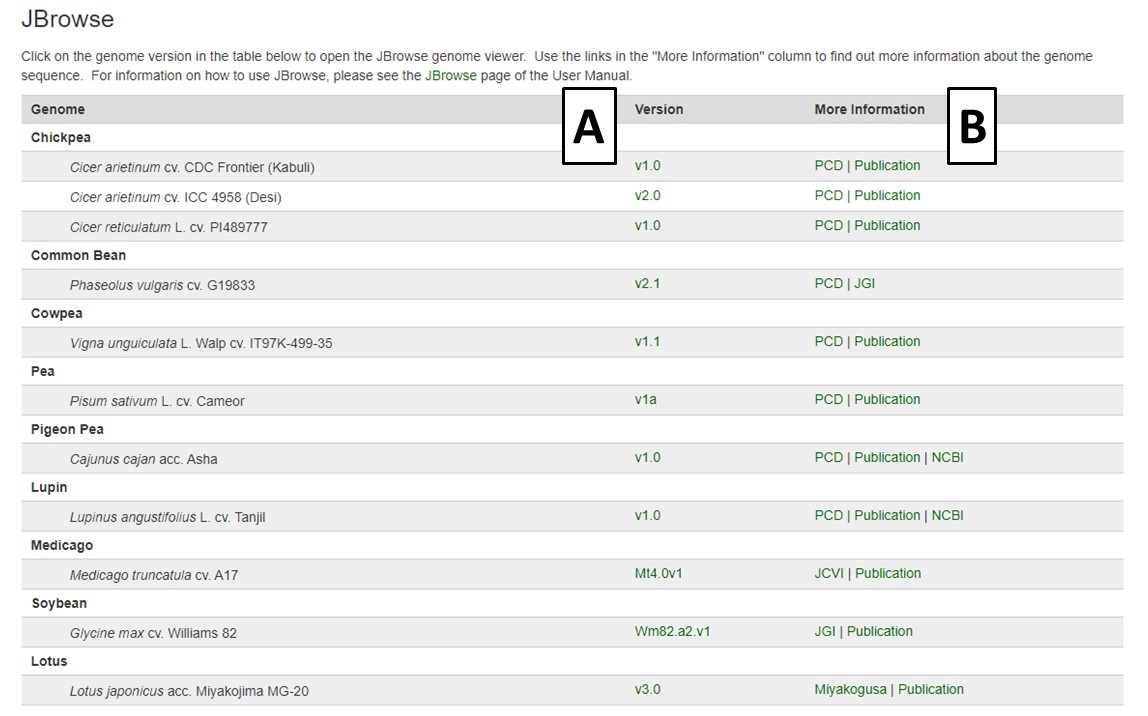
Figure 28. The JBrowse homepage on PCD.
Within the JBrowse window for each genome, there is a left side bar where tracks can be turned on and off (Fig. 29A). There is also a toolbar above the genome region being displayed where the user can zoom in and out, scroll, and select sequences (Fig. 29B). Users can also type a scaffold name and location or a gene or mRNA name in to view that specific feature. Clicking on a gene or mRNA feature also opens a window with more details and a link to information about that feature on the PCD database. Please watch the JBrowse tutorial for more details about how to navigate and use JBrowse.
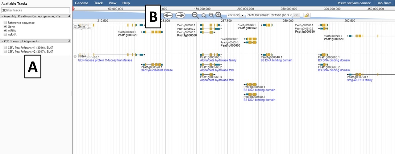
Figure 29. JBrowse interface for a genome.
PathwayCyc
PathwayCyc pathways were generated using Pathway Tools and are available under the PathwayCyc link in the Tools menu. Pathway Tools allows users to view metabolic pathways that are in genomes. Please see the manual for Pathway Tools for more information on use. To access the different genomes, click on the hyperlink in the genome name (Fig. 30).
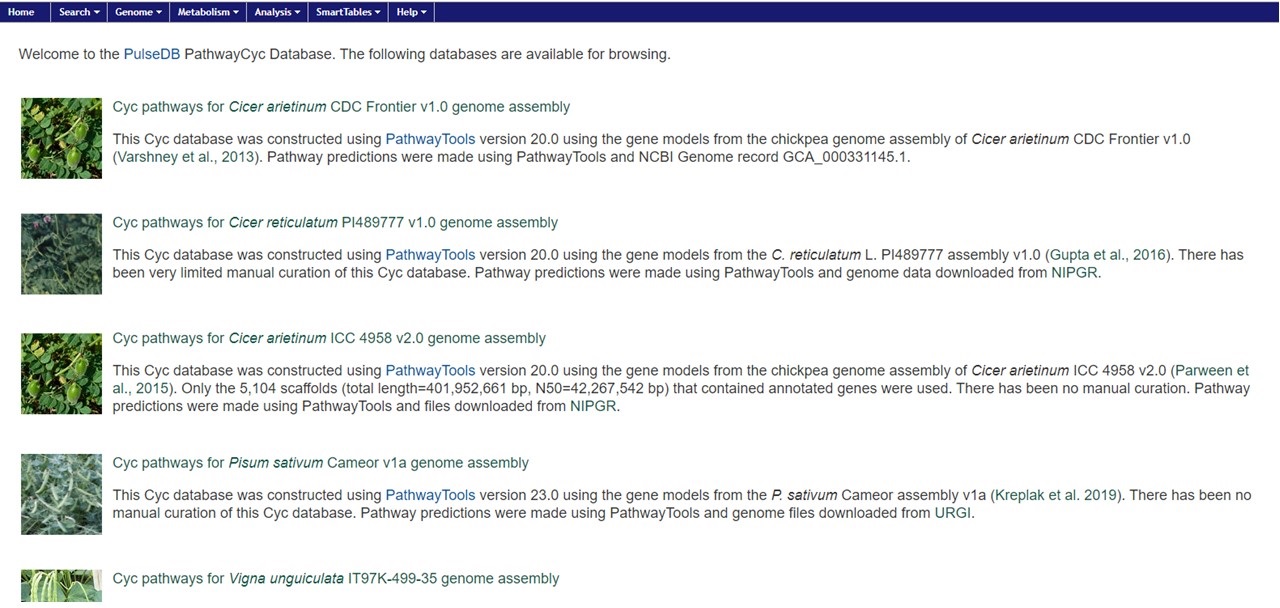
Figure 30. PathwayCyc page with genome list.
Once the genome is selected, the PathwayCyc interface opens and an overview of the genome statitstics is shown. Using the 'Metabolism' menu, the Cellular Overview can be opened as in Fig. 31. Individual pathways can be selected and explored.
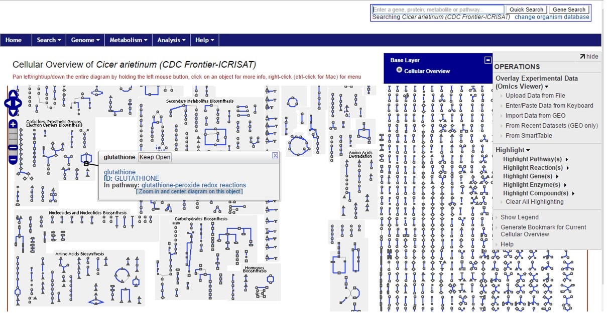
Figure 31. CDC Frontier cellular overview
MapViewer
MapViewer is a new tool for viewing genetic maps on PCD. There are multiple ways to access MapViewer and the first way is from the Tools menu in the header. The link under Tools opens a MapViewer interface (Fig. 32). On this interface, select the species, map, and linkage group to be viewed and click submit (Fig. 32A). The selected linkage group then opens in a new window (Fig. 32C). There are also links to tutorials and examples (Fig. 32B).
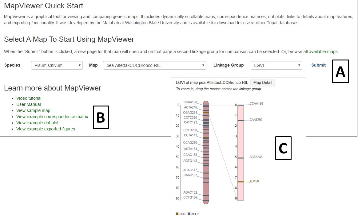
Figure 32. MapViewer interface found under Tools menu.
Another way to access the maps is via the Map Overview page (Fig. 33). The Map Overview page displays a summary graphic of all linkage groups (Fig. 33A) and clicking a linkage group opens a more detailed view in MapViewer. The Map Overview page also has informaiton about the population that the map was generated from (Fig. 33B) and also links to lists of the markers and QTLs on the map (Fig. 33C).
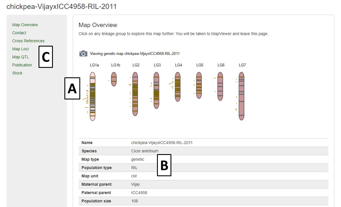
Figure 33. Map Overview page.
MapViewer displays the complete linkage group, and QTLs, on the left, and the selected region on the right (Fig. 24A). The selected region can be changed by dragging and resizing a window on the complete linkage group on the left side. There is a legend of the marker colors below the linkage group figure. Information about the markers is displayed when the pointer is over a marker name on the right side graph (Fig. 34B). Clicking on the marker name, opens the marker details page.
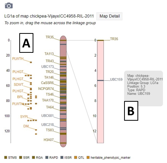
Figure 34. MapViewer displays a static linkage group graph on the left and a dynamic graph on the right.
A different map or linkage group can be displayed using the controls at the bottom of the MapViewer page (Fig. 35A). A comparison map can also be turned on by clicking on the "Show comparison map" box (Fig. 35B). The color of the markers and which markers are displayed can be changed with the controls and the ruler and marker positions can also be toggled on or off (Fig. 35C). After changing any of the four parameter sections, the Submit button must be pressed to display the changes. There are also places to click to view the Dot Plot and Correspondence Matrix for the compared maps.
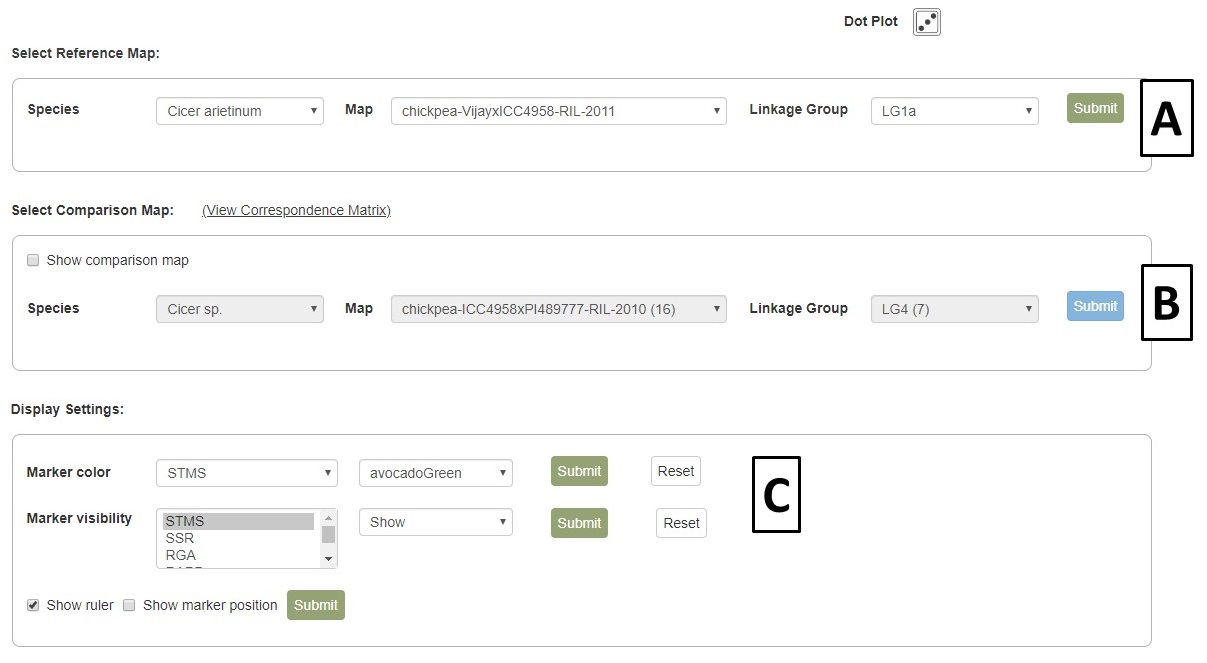
Figure 35. MapViewer control panel.
When comparison maps are displayed (Fig. 36), the common loci are connected with a line and the zoomed in area for each map can be adjusted independently. See the next section of the manual to learn about exporting figures from MapViewer.
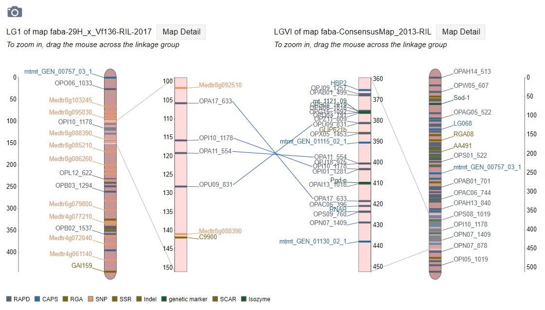
Figure 36. Comparison map view.
Pictures from MapViewer
MapViewer allows users to export figures as a high-resolution PNG file that is suitable for publication. Items that can exported have a clickable camera icon that will trigger a file download. Users can export the map overview which has all the linkage groups (Fig. 37), a single linkage group (Fig. 38), a linkage group comparison (Fig. 39), a dot plot (Fig. 40) or a correspondence matrix (Fig. 41).
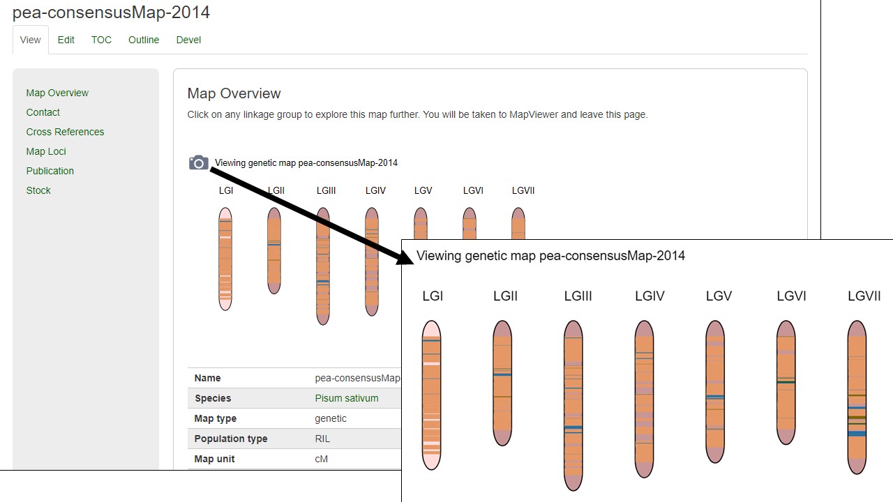
Figure 37. How to download a map overview.
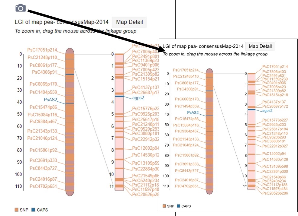
Figure 38. How to download a linkage group figure.
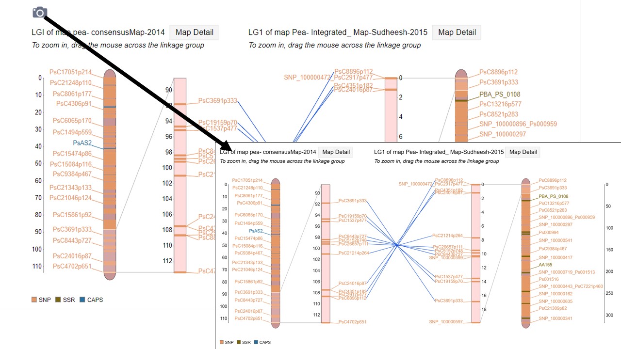
Figure 39. How to download a linkage group comparison figure.

Figure 40. How to download a linkage group comparison dot plot.
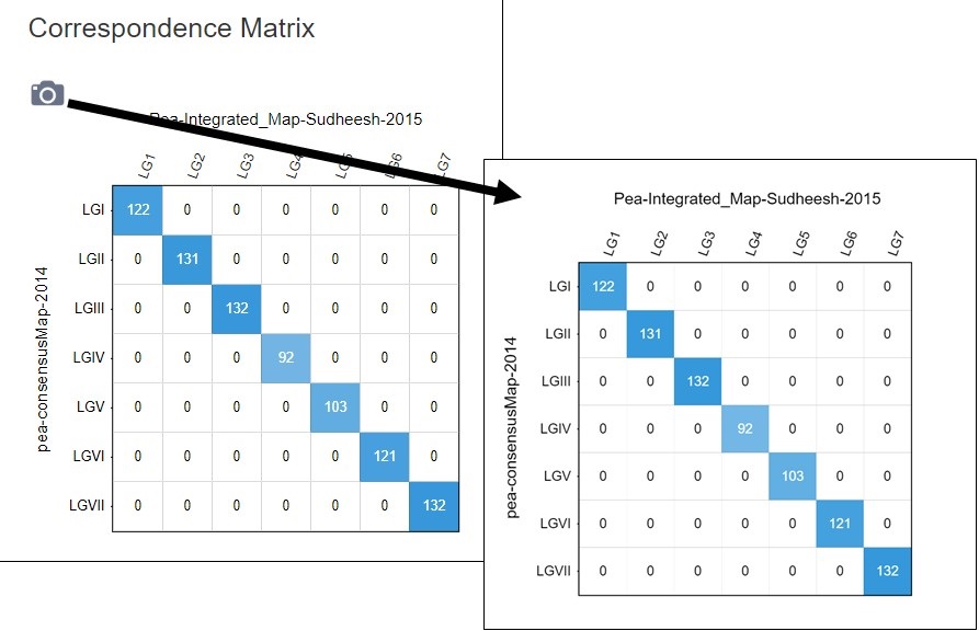
Figure 41. How to download a linkage group comparison correspondence matrix.
Synteny Viewer
PCD uses the Tripal Synteny Viewer, developed by the Fei Bioinformatics Lab, to display the analysis results of genomes that were compared using the program MCScanX. Synteny Viewer is accessed under the "Tools" menu. To get started with Synteny Viewer, first select a genome (Fig. 42A). The "Chromosome/Scaffold" menu will then populate with the names of the appropriate scaffolds or chromosomes and one of these sequences can be selected (Fig. 42B). The final option is to select one or more genomes for comparison (Fig. 42C), and then the "Search button" is clicked to start the search. Alternatively, if the block ID number is already known, the block ID value can be input directly to return just those results.
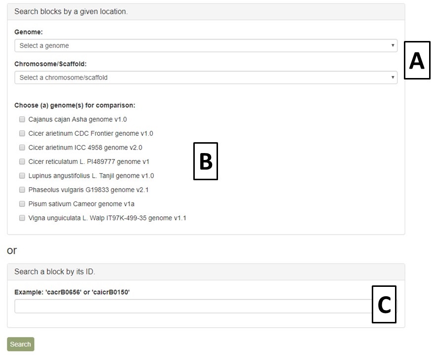
Figure 42. Options for Synteny Viewer search.
When the search is complete, a new page opens with the results. There is a summary of the input settings at the top of the page. When multiple genomes are queried, there are tabs to switch between the results and the circular graph will change when a different genome is selected. The syntenic regions are indicated on the circular graph by gray lines. When the mouse hovers over the gray line, a summary is displayed (Fig. 43). Clicking on the gray lines, opens a page with more details (see below, Fig. 45).
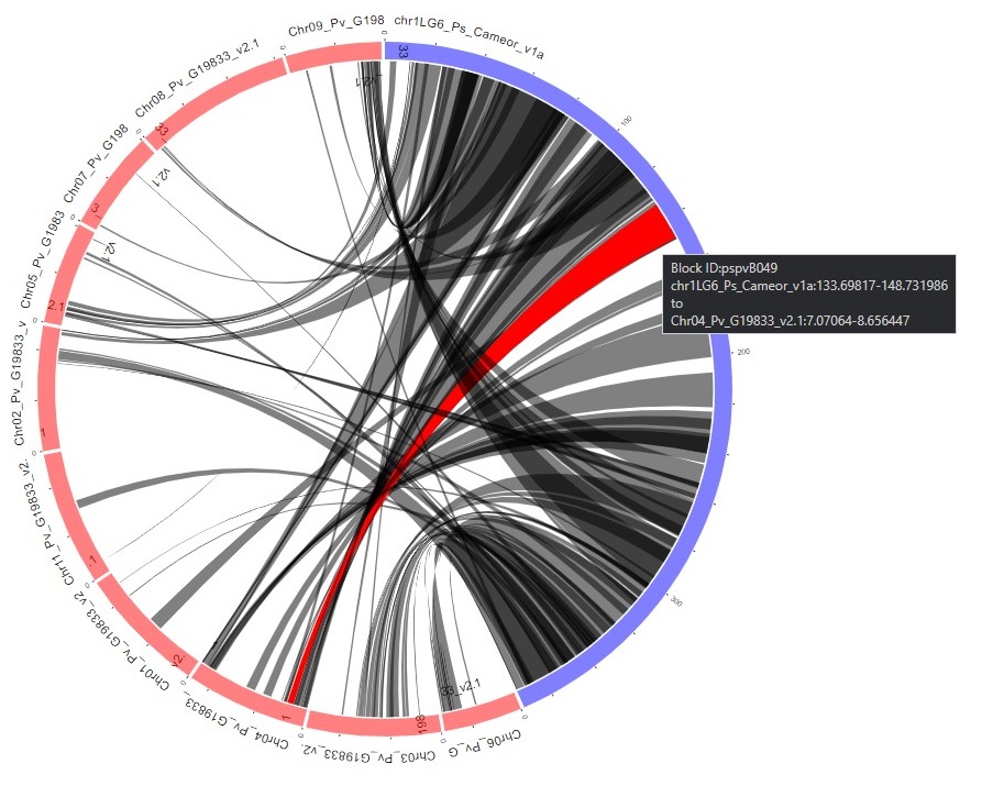
Figure 43. Synteny results in circular graph.
Under the circular graph is a table listing the syntenic blocks (Fig. 44) that are displayed as gray lines in the circular graph. Clicking on the block name opens the same details page as clicking on the gray lines on the circular graph.
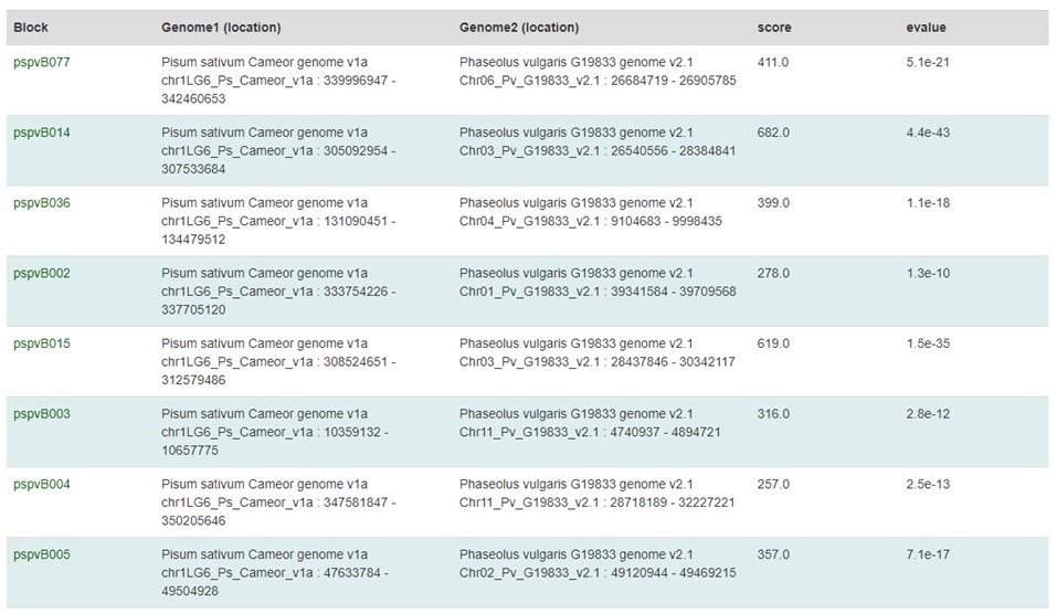
Figure 44. Synteny block table.
The syntenic block details page has an overview section at the top listing the details for each genome in the comparison, a side-by-side graphic of the syntenic block from each genome, and a table showing the genes in the syntenic block from each genome (Fig. 45). The side-by-side graph can be zoomed-in by using the scroll wheel on the mouse and the view can be shifted up or down by click and dragging. Clicking on the gene name in either the table or on the graphic will open the feature details page from the PCD database.
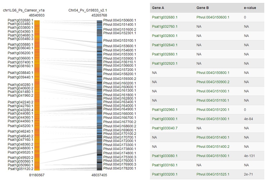
Figure 45. Syntenic Block details page.