MapViewer
MapViewer is a new tool for viewing genetic maps on PCD. There are multiple ways to access MapViewer and the first way is from the Tools menu in the header. The link under Tools opens a MapViewer interface (Fig. 32). On this interface, select the species, map, and linkage group to be viewed and click submit (Fig. 32A). The selected linkage group then opens in a new window (Fig. 32C). There are also links to tutorials and examples (Fig. 32B).
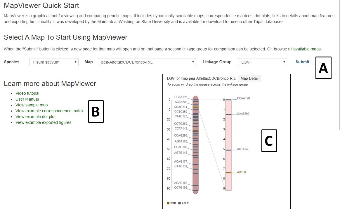
Figure 32. MapViewer interface found under Tools menu.
Another way to access the maps is via the Map Overview page (Fig. 33). The Map Overview page displays a summary graphic of all linkage groups (Fig. 33A) and clicking a linkage group opens a more detailed view in MapViewer. The Map Overview page also has informaiton about the population that the map was generated from (Fig. 33B) and also links to lists of the markers and QTLs on the map (Fig. 33C).
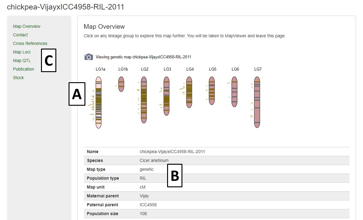
Figure 33. Map Overview page.
MapViewer displays the complete linkage group, and QTLs, on the left, and the selected region on the right (Fig. 24A). The selected region can be changed by dragging and resizing a window on the complete linkage group on the left side. There is a legend of the marker colors below the linkage group figure. Information about the markers is displayed when the pointer is over a marker name on the right side graph (Fig. 34B). Clicking on the marker name, opens the marker details page.
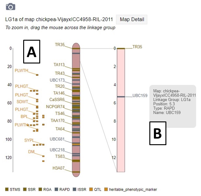
Figure 34. MapViewer displays a static linkage group graph on the left and a dynamic graph on the right.
A different map or linkage group can be displayed using the controls at the bottom of the MapViewer page (Fig. 35A). A comparison map can also be turned on by clicking on the "Show comparison map" box (Fig. 35B). The color of the markers and which markers are displayed can be changed with the controls and the ruler and marker positions can also be toggled on or off (Fig. 35C). After changing any of the four parameter sections, the Submit button must be pressed to display the changes. There are also places to click to view the Dot Plot and Correspondence Matrix for the compared maps.
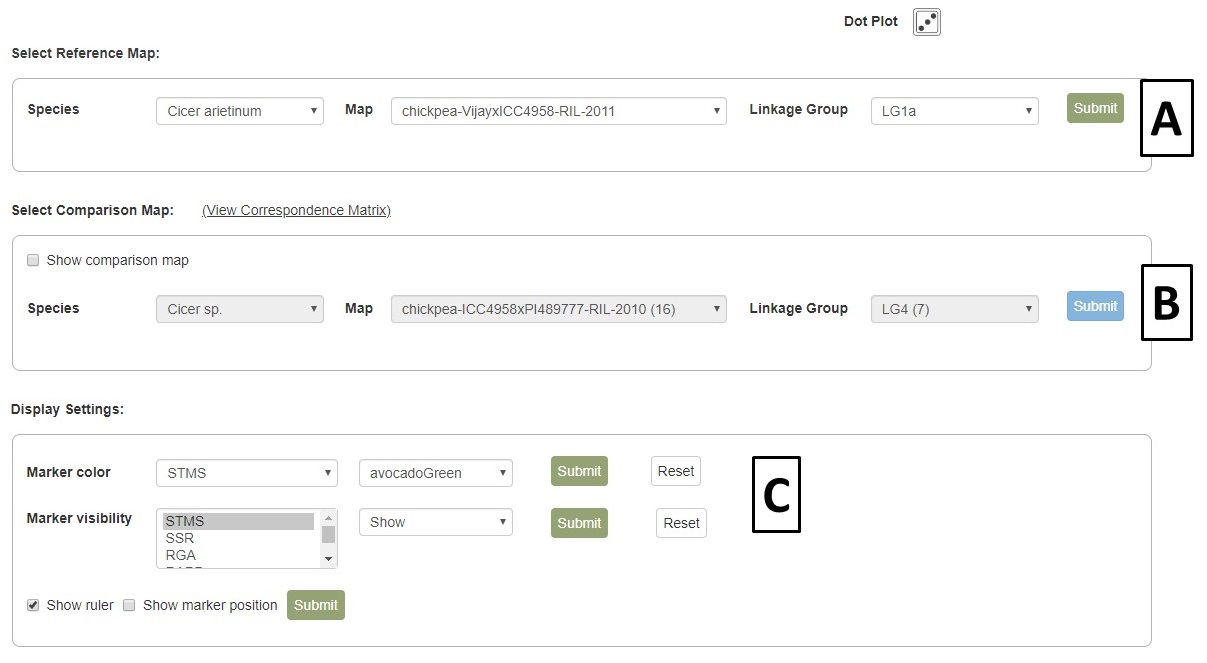
Figure 35. MapViewer control panel.
When comparison maps are displayed (Fig. 36), the common loci are connected with a line and the zoomed in area for each map can be adjusted independently. See the next section of the manual to learn about exporting figures from MapViewer.
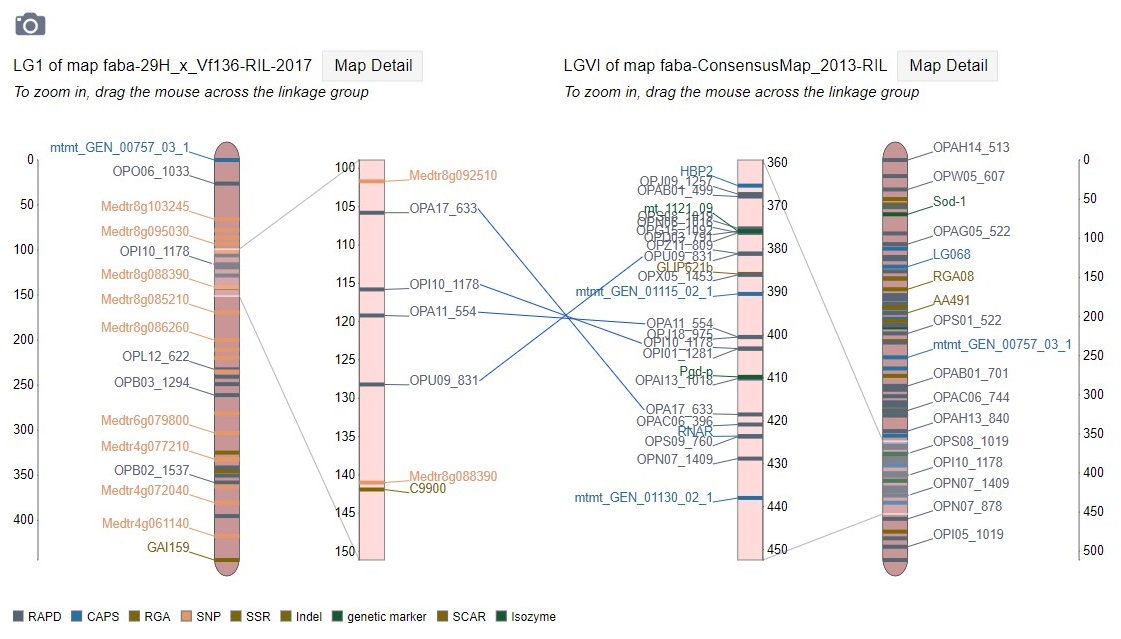
Figure 36. Comparison map view.
Pictures from MapViewer
MapViewer allows users to export figures as a high-resolution PNG file that is suitable for publication. Items that can exported have a clickable camera icon that will trigger a file download. Users can export the map overview which has all the linkage groups (Fig. 37), a single linkage group (Fig. 38), a linkage group comparison (Fig. 39), a dot plot (Fig. 40) or a correspondence matrix (Fig. 41).
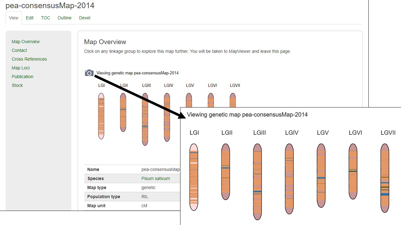
Figure 37. How to download a map overview.
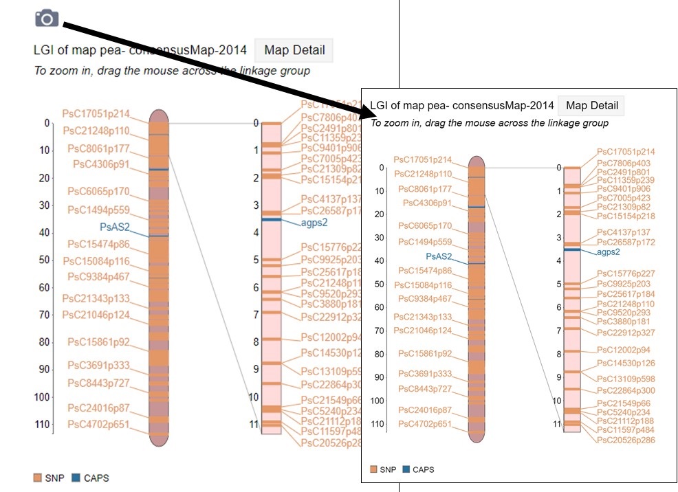
Figure 38. How to download a linkage group figure.
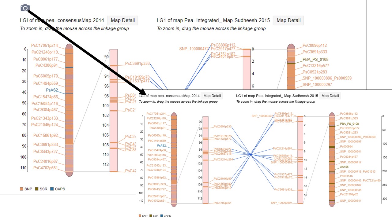
Figure 39. How to download a linkage group comparison figure.

Figure 40. How to download a linkage group comparison dot plot.
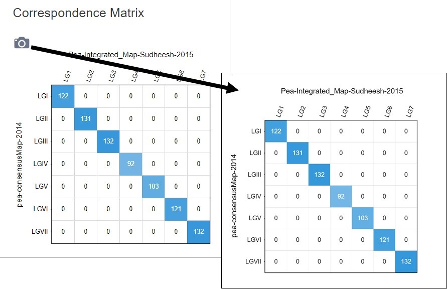
Figure 41. How to download a linkage group comparison correspondence matrix.